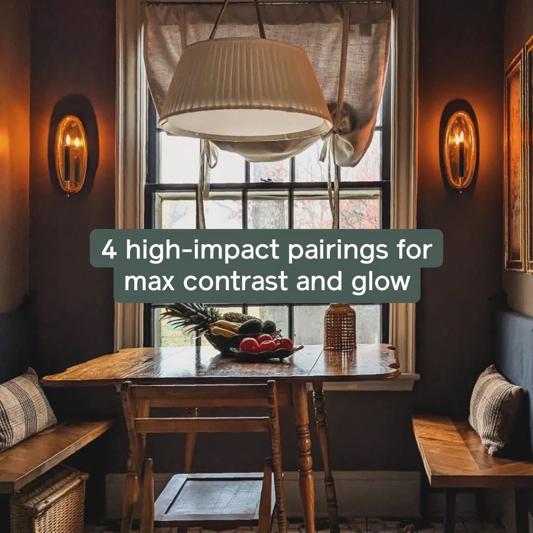
✨ Pairing paint isn’t just about matching—it’s about creating a vibe that feels right. Whether you’re going for bold contrast or soft harmony, the right duo can totally transform a space. ✨ These four duos showcase how the right combination can elevate a room, adding depth, dimension and a sense of intention: 1️⃣ Money Moves + Grayish – An earthy, grounded duo that feels warm and effortless 2️⃣ Timeless + Current Mood – A bold-meets-balanced combo with just the right amount of drama 3️⃣ Dirty Chai + Flatiron – A tonal pairing that brings layered, monochromatic depth 4️⃣ Field Trip + Meet Cute – A high-contrast mix that’s playful yet surprisingly refined Which pair speaks to your vibe? 📸: @miracleonthirtyfourth, @ashleyswhiteside, @homebody_hq, @casa_de_car #paintcolors #interiordesigntips #colorpairing #designdetails #colortheory #homeinspo #clarepaint #moderncolor #colorconfidence #designwithintention #clarepaint #shareyourclare
Channel/Medium:
Instagram
onApr 24, 2025Clare
clare.com
Details
✨ Pairing paint isn’t just about matching—it’s about creating a vibe that feels right
Apr 24, 2025, 3:13 PM
Search thousands of other brands for emails, ads, social media posts, and more.
The Particl web app allows you to see how an email or ad campaign affected sales over time.
Explore emails, ads, and more
Agencies and marketers can cut through the noise and find the best ads, campaigns, and social media content about Clare all in one place, completely free. Take it a step further in the Particl app to see how those campaigns are performing.